

Analyze Six Popular Color Series in Furniture
Hey there, furniture fans and design lovers! If you’re like me, scrolling through home decor feeds or wandering showrooms, you’ve probably noticed how colors can totally transform a space. Colors aren’t just accents—they’re the heartbeat of furniture trends. Today, we’re diving into six hot color series shaking up the furniture world: Morandi, Memphis, Macaron, Maillard, Mondrian, and Dunhuang. We’ll break them down, see how they play out in real pieces like dining tables or chairs, and chat about why they’re popping up everywhere. Drawing from what’s hot in the industry right now, based on spots like Forest Furniture’s lineup—think sleek MDF tables and upholstered chairs—this guide aims to help you pick colors that fit your vibe. Whether you’re revamping a cozy kitchen or outfitting a trendy cafe, let’s get colorful.
Why Color Series Matter in Furniture Design
Colors in furniture do more than look pretty. They set moods, match lifestyles, and even boost sales for retailers. Take a quick stat: according to some industry reports I’ve skimmed, about 85% of buyers say color influences their picks first. It’s wild, right? These series aren’t random; they’re inspired by art, food, nature—you name it. They help designers mix and match without clashing. And hey, if you’re in wholesale like the folks at Forest Furniture, knowing these can give you an edge in stocking what sells. We’ll explore each one, with tips on application. Buckle up.
Morandi Colors: Soft and Subtle Vibes
Morandi colors, named after that Italian painter Giorgio Morandi, are all about those muted, dusty tones. Think foggy grays, pale blues, soft pinks—nothing screams loud. They’re like a whisper in a noisy room.
In furniture, Morandi shines in pieces that need calm. Why popular? They’re versatile. In small apartments, these colors make rooms feel bigger, less cluttered.
Key shades:
Dusty rose, sage green, taupe.
Best uses:
Bedrooms or living rooms where you want relaxation.
Pro tip:
Layer with textures, like boucle fabric on armchairs, to add depth without overwhelming.
I once helped a friend redo her home office with Morandi-inspired shelves. It turned a chaotic corner into a zen zone. Not too flashy, just right.
Memphis Colors: Bold and Playful Energy

Switching gears, Memphis colors scream fun—vibrant primaries mixed with geometrics, inspired by the 1980s Memphis Group. Reds, yellows, blues, often clashing on purpose. It’s like your furniture threw a party.
Furniture-wise, think accent pieces. A bright yellow side table or a patterned sofa could nod to this. Though Forest Furniture leans more modern, their Aura armchairs in cream could get a Memphis twist with bold cushions. Retailers love it for kids’ rooms or eclectic cafes.
But here’s a tangent: I tried Memphis in my kitchen once—painted a chair electric blue. Looked cool, but man, it clashed with everything else. Lesson learned: start small.
|
Shade |
Mood |
Furniture Example |
|
Electric Blue |
Energetic |
Geometric coffee tables |
|
Sunny Yellow |
Cheerful |
Upholstered benches |
|
Fiery Red |
Daring |
Lounge chairs |
Memphis isn’t for minimalists, but if you want personality, it’s gold.
Macaron Colors: Sweet and Pastel Charm
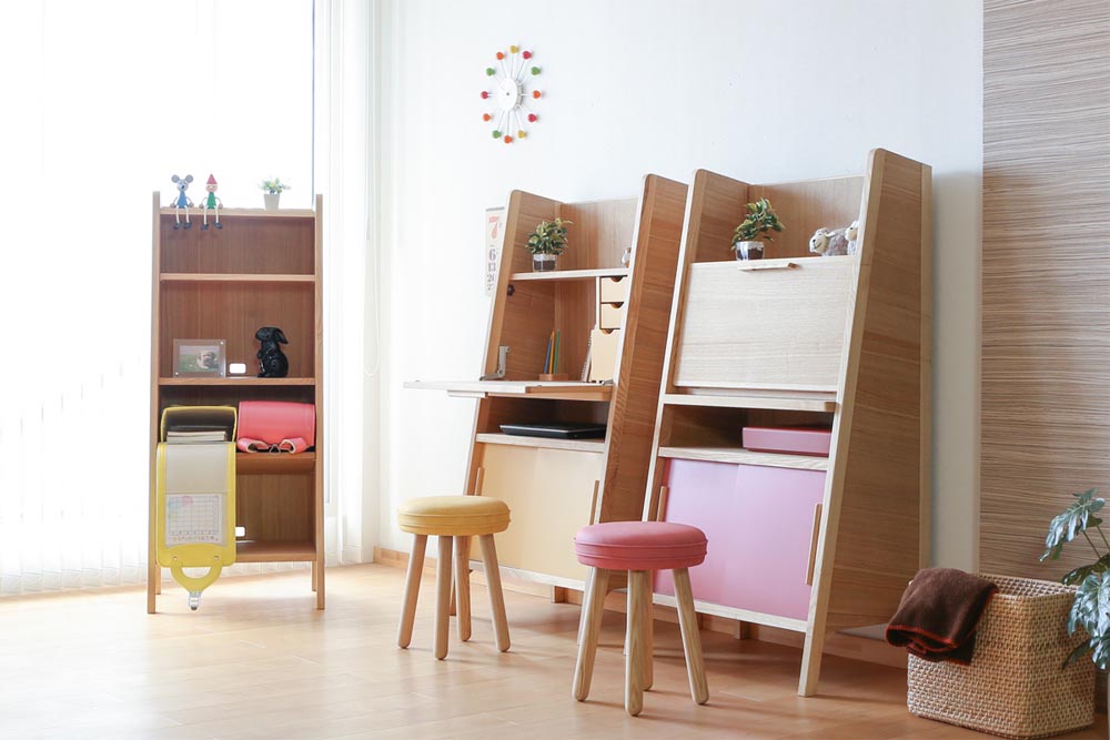
Macaron colors? Straight from those French treats—soft pastels like mint green, lavender, baby pink. Delicate, yummy-looking. They’re huge in nurseries or feminine spaces.
Apply to furniture: Picture a pale blue dining table, maybe with a sintered stone top like Forest’s Gisil in a lighter vibe. Or Macaron-hued chairs around it for a brunch-ready setup. These colors feel fresh, not overwhelming.
Why trending? Social media. Influencers post pastel setups, and boom—sales spike.
Mix ideas: Pair with whites for a clean look, or add gold accents for glam.
Honestly, macarons make me hungry just thinking about it. But in design, they’re a safe bet for rentals, easy to refresh.
Maillard Colors: Warm and Toasty Tones
Ah, Maillard colors—named after that browning reaction in cooking, like caramelized onions or toasted bread. Warm browns, ambers, deep oranges. Cozy as a fall sweater.
In furniture, it’s perfect for wood pieces. Forest Furniture’s Veiko extendable table in light natural? That’s Maillard territory, with its veneer mimicking those toasty hues. Upholstered sofas in caramel leather fit too.
Now, comparing to earth tones: Maillard overlaps with earth colors—like browns from soil or trees—but it’s more about that food-inspired warmth. Earth tones are broader: beige, khaki, ochre, all grounded in nature. They’re steady, versatile for any room.
How to pair earth tones better? Mix shades for depth. A dark brown chair with beige cushions looks richer than all one color. Or blend Maillard’s amber with earth’s taupe on a bed frame—creates layers, feels inviting. I’ve seen it in hotel lobbies: earth-toned tables with Maillard accents in lamps. Adds warmth without monotony.
Quick fact:
In 2024 surveys, warm tones like these boosted comfort ratings by 30%. No wonder they’re hot.
Mondrian Colors: Geometric and Structured
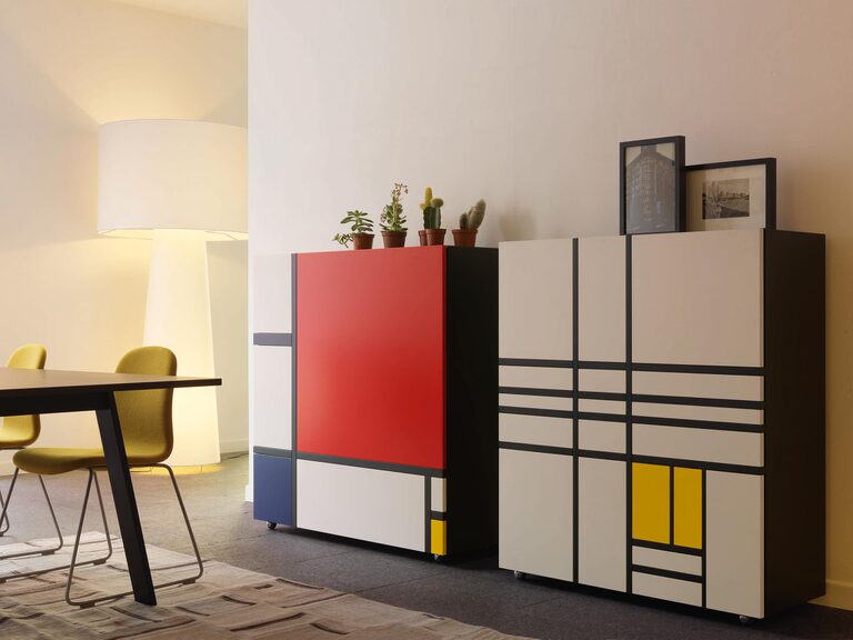
Mondrian colors draw from Piet Mondrian’s art—primary reds, blues, yellows, blacks, whites in grids. Clean lines, bold blocks.
Furniture application: Modular shelves or tables with color-blocked panels. Imagine Forest’s Apex white MDF table edged in black and red—very Mondrian. Great for offices or modern lofts.
Strengths:
Adds structure to chaotic spaces.
Challenges:
Can feel cold if overdone; warm it up with plants.
I remember a gallery using Mondrian-inspired chairs—super artsy, but some folks found them too rigid. Balance is key.
Dunhuang Colors: Exotic and Cultural Depth
Dunhuang colors come from those ancient Chinese cave murals—rich terracottas, golds, deep blues, earthy reds. Mystical, historical vibe.
In today’s furniture, it’s exotic accents. A gold-trimmed armchair or red travertine table like Forest’s Aurel echoes this. Popular in luxury homes or Asian-inspired decor.
Why love it? Cultural storytelling. Pairs well with silks or woods.
Tangent: Visited a Dunhuang exhibit once—colors popped so vividly. Translates beautifully to a statement sofa.
Spotlight on Forest Furniture: Your Go-To Supplier
Before wrapping up, let’s talk about Forest Furniture real quick. Based in Tianjin, China, they’re a solid manufacturer and exporter cranking out everything from solid wood tables and chairs to upholstered pieces like sofas and beds. They’ve got factories across northern China, ensuring quality and quick turnaround. Their range includes trendy stuff like extendable MDF dining tables or modern armchairs with metal legs. They work with wholesalers worldwide—Europe, Australia, you name it—and focus on customization. If you’re hunting for pieces in these color series, their catalog’s worth a peek. Plus, they’re all about sustainability, using responsibly sourced woods. Solid choice for bulk buys or fresh designs.
Conclusion: Picking Your Perfect Palette
Wrapping this up, these six color series—Morandi, Memphis, Macaron, Maillard, Mondrian, and Dunhuang—offer endless ways to jazz up furniture. From soft Morandi calm to bold Memphis energy, each brings something unique. Mix them thoughtfully, like blending Maillard warms with earth tones for that cozy feel, and your space sings. Trends shift, but good color choices last. Experiment, have fun, and see what clicks for you.
FAQs: Quick Answers on Furniture Color Series
What are the six popular color series in furniture, and how do they differ?
The six are Morandi (muted pastels), Memphis (bold primaries), Macaron (sweet pastels), Maillard (toasty warms), Mondrian (geometric blocks), and Dunhuang (cultural earthies). They vary in vibe—Morandi’s chill, Memphis is wild—letting you match any style.
How can I incorporate Maillard colors into my home without clashing?
Start simple: A Maillard-toned chair or table. Pair with earth tones like beige for balance. I’ve seen it work wonders in kitchens—feels warm, not overwhelming.
Are these color series sustainable for furniture makers?
Yeah, many like Maillard use natural dyes on woods. Suppliers like Forest Furniture prioritize eco-materials, so you get trendy without the guilt.
Which color series is best for small spaces?
Morandi or Macaron—they’re light, make rooms feel bigger. Avoid heavy Dunhuang unless you want drama.
How do earth tones relate to these series in furniture design?
Earth tones overlap, especially with Maillard, adding natural steadiness. Pair them for depth, like khaki cushions on a brown frame—super versatile.